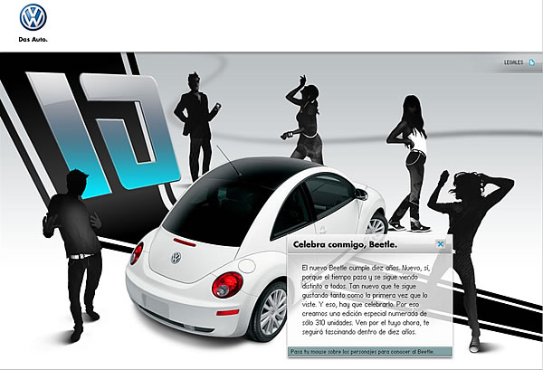
The New Beetle is ten years old and Volkswagen Mexico has launched a limited numbered edition to celebrate. They have also launched a special website for us to visit. A really good development with cool animations and transitions. Shame on the flash loaders, that are so hidden that the common user might not see them. (hint: see the blue bar at the top) The New Beetle is ten years old. New, yes, because time goes on and it keeps looking completely different from others. It is so new that keeps liking you so much as the first time you saw it. And that is for celebrating. Do you remember the first time you saw it? For the first time, a car that didn’t seem like any other, it was completely different. “Like ten years ahead”, you said. Almost like twenty, don’t you think so? Wait another ten years and you’ll see. In the meanwhile, Seguir leyendo
10 usability nightmares…
Smashing Magazine published a few months ago an interesting list of usability nightmares that you should be aware of: Hidden log-in link One of the most used links (if not the most) should be always placed in a relevant and visible position. Pop-ups for content presentation It is really not a good idea to open a pop-up window to show the content, at the end, browsers nowadays block automatically that kind of javascripts and so you’re forced to use the famous “if the window has not opened click here”. Dragging instead of vertical navigation There are some flash enthusiast that keep going under the idea that the user has to “discover” the way a site must be used. The dragging technique claims to break the scrolling paradigm and let users interact with the page dragging it instead of scrolling. This might become a new trend in the future but for Seguir leyendo
