Leer un libro en un iPad o en un Kindle es en promedio 8.45% más lento que leerlo impreso.
Usabilidad
10 Rules to Augment Fun and Beauty in Interaction Design
Just found these 10 Rules for augmenting the fun and beauty when designing interaction: Don’t think products, think experiences. Don’t think beauty in appearance, think beauty in interaction. Don’t think ease of use, think enjoyment of the experience. Don’t think buttons, think rich actions. Don’t think labels, think expressiveness and identity. These were taken from the Funology book: “Let’s Make things Engaging” by Overbeeke et. al. Continue reading the list.
Augmented Reality: The Next in Mobile User Experience
“Think of Augmented Reality as half virtual and half real. It takes existing physical spaces and supplements or “augments” them with information, objects, actions or interactions.” Some applications include: Location based Restaurant finder with reviews Location based Travel points of interest Virtual pet for the iPhone Public transportation schedule and station finder Virtual objects you can interact with in the real world Look at the videos to see great examples: More @ Demystifying Usability
Bad Usability Calendar 2009
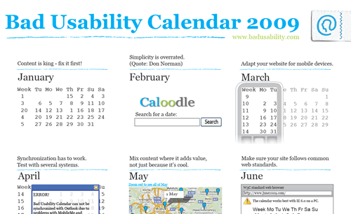
Learning by bad examples is often a good way in discussing usability with people that are not hardcore usability people. Badusability.com released the Bad Usability Calendar 2009, which includes: JAN: Content is King: Fix it first! FEB: Simplicity is overrated. MAR: Adapt your website for mobile devices. APR: Synchronization has to work. … Download the complete calendar here. Via JustAddWater
KidZui – The Internet for Kids

Have you ever wonder how an Internet browser for kids might look like? Try KidZui, a free internet browser that offers a collection of over a million kid-friendly games, websites, pictures and Youtube videos. For parents, KidZui offers an online console to monitor their kids’ online activity and define what content is suitable for them to see. There is also a membership that lets kids get more features on the browser and enables parents with even more sophisticated parental controls.
15 Incredible Conceptual Designs (you wish existed)

Talking about usability and consumer products. Creativecloseup.com published this collection of 15 great designs that, as they say, for several reasons may never reach the production stage, but may set a trend and definitely make us whish they really existed.
10 usability nightmares…
Smashing Magazine published a few months ago an interesting list of usability nightmares that you should be aware of: Hidden log-in link One of the most used links (if not the most) should be always placed in a relevant and visible position. Pop-ups for content presentation It is really not a good idea to open a pop-up window to show the content, at the end, browsers nowadays block automatically that kind of javascripts and so you’re forced to use the famous “if the window has not opened click here”. Dragging instead of vertical navigation There are some flash enthusiast that keep going under the idea that the user has to “discover” the way a site must be used. The dragging technique claims to break the scrolling paradigm and let users interact with the page dragging it instead of scrolling. This might become a new trend in the future but for now it should be kept only for showcases or demonstrations about flash capabilities. Invisible links It is not wise to hide links under a ton of images, links should be visible and clear. Visual noise Adding too many graphical elements can turn the website into a real chaos. Keep in Seguir leyendo
Tangible Media: El futuro de la experiencia del usuario
A lo largo del tiempo hemos tenido que adaptar nuestros hábitos a nuevas tecnologías que prometen facilitar la manera en la que trabajamos. De esta manera hemos adoptado al mouse y el teclado como las herramientas básicas de interacción con una computadora. Hemos también adoptado el concepto de las ventanas y el hecho de que sólo podemos hacer una cosa a la vez (minimizar una pantalla, hacer scroll o cambiarla de tamaño son tareas que no podemos hacer simultáneamente) como paradigma de la interacción humano-computadora. Smashing Magazine publicó recientemente un artículo donde muestra algunos avances en cuanto a experiencia del usuario se refiere. Cheoptics360 Es un producto creado por Vizoo que puede proyectar hologramas en 3D desde 1.5 hasta 30 metros de altura, tanto en interiores como en exteriores. Reactable Es un instrumento musical colaborativo con una interfaz táctil con la cual múltiples usuarios en simultáneo pueden controlar el instrumento moviendo o rotando los objetos físicos que se encuentran sobre la superficie. Multi-Touch Este es un dispositivo que acepta comandos ejecutados al mismo tiempo a través de diferentes dedos de la misma o diferentes personas. A través de la interfaz se pueden manipular los objetos e interactuar con el sistema Seguir leyendo
La analogía del iceberg
¿Qué es lo que hace a un website exitoso? Al contrario de lo que muchas personas (e inclusive algunas agencias) pudieran pensar, no es la imagen ni el contenido, sino todo lo que está debajo, aquello que lo sustenta y hace que todo funcione bien. Vía Isopixel me encuentro este interesante gráfico que, haciendo la analogía con un iceberg, muestra que hay más que un bonito diseño y un buen contenido en la lista de cosas a considerar cuando se desarrolla un website. El artículo original en inglés se puede obtener aquí.
Usuarios 2.0
NoSoloUsabilidad presenta un estudio sobre la evolución del perfil del usuario, desde el amateur, o inicial, hasta uno experto, pasando por el usuario intermedio y el avanzado, o dos punto cero. En su artículo, Ortega Santamaría expone la manera en la que se puede estudiar esta evolución y el comportamiento o patrones que distinguen a un usuario 2.0: “Usuarios que han disuelto por completo las barreras sociales y no tienen miedo a exagerar los alcances y las bondades de las nuevas tecnologías”; “a estos usuarios podemos encontrarlos, sin duda, en Flickr, Del.icio.us, Fotolia, Panoramio, Click2map, Neurona, Odeo o Youtube”. “Los usuarios dos punto cero aportan, difunden, comparten y colaboran con el objetivo de generar redes sociales” .. “que le faciliten una aprobación social contínua, para alimentar la tentación egocéntrica“. Las nuevas generaciones cada vez más se van acercando a esta clase de perfil, por lo que se vuelve imperativo estudiarlo y entender su comportamiento antes de emprender cualquier campaña que las ubique como su objetivo. Más información en NoSoloUsabilidad