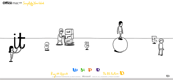
Microsoft has launched a new website to promote Office 2008 for Mac. A really good approach with the simplification methaphora. The bad thing is when you want to “learn more” about the product, you are redirected to the traditional (and not-so-simplified) MS website. Simplify your Work Via Cpluv
Coca-Cola: The happiness factory
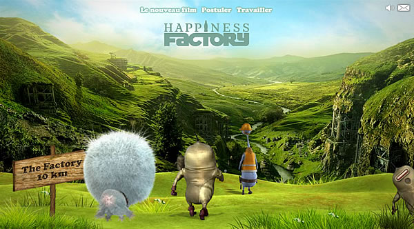
Coca-Cola has launched in France a new website that might extend the “Happiness Factory” concept to the online world. Regardless that the website takes a while to load, the graphics at the very first sight are really good. Once you start browsing you realize that in fact the development is too heavy, so it is difficult to really enjoy it. The advergame is really complicated. At the end, a really good effort but only enjoyable by those who have a broadband internet connection. Via Adverblog
Tangible Media: The future on the user’s experience
Along the time we have been forced to adapt our habits to new technologies that promise to facilitate the way in which we work. Thus, we have adopted the mouse and the keyboard as the main tools to interact with computers. We have also adopted the windows concept and the fact that we can only make one task at a time (minimize a window, scroll or change the window’s size are tasks that can’t be performed simultaneously) as our paradigm for human-computer interaction. Smashing Magazine published recently an article showing some improvements regarding the user’s experience. Cheoptics360 It is a product by Vizoo that can display 3D holograms with an altitude from 1.5 to 30 meters, regardless it is outside or inside. Reactable It is a collaborative musical instrument with a touchable interface in which many users can control the instruments simultaneously by moving or rotating physical objects that are Seguir leyendo


