Just found these 10 Rules for augmenting the fun and beauty when designing interaction: Don’t think products, think experiences. Don’t think beauty in appearance, think beauty in interaction. Don’t think ease of use, think enjoyment of the experience. Don’t think buttons, think rich actions. Don’t think labels, think expressiveness and identity. These were taken from the Funology book: “Let’s Make things Engaging” by Overbeeke et. al. Continue reading the list.
usability
Augmented Reality: The Next in Mobile User Experience
“Think of Augmented Reality as half virtual and half real. It takes existing physical spaces and supplements or “augments” them with information, objects, actions or interactions.” Some applications include: Location based Restaurant finder with reviews Location based Travel points of interest Virtual pet for the iPhone Public transportation schedule and station finder Virtual objects you can interact with in the real world Look at the videos to see great examples: More @ Demystifying Usability
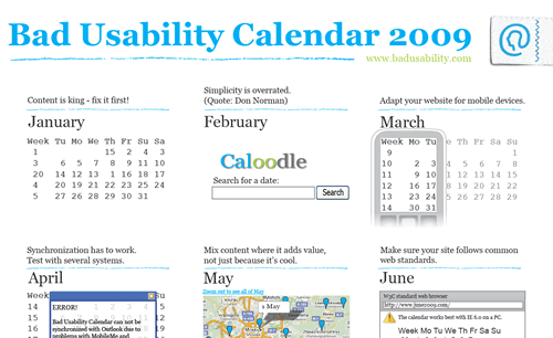
Bad Usability Calendar 2009
Learning by bad examples is often a good way in discussing usability with people that are not hardcore usability people. Badusability.com released the Bad Usability Calendar 2009, which includes: JAN: Content is King: Fix it first! FEB: Simplicity is overrated. MAR: Adapt your website for mobile devices. APR: Synchronization has to work. … Download the complete calendar here. Via JustAddWater
10 usability nightmares…
Smashing Magazine published a few months ago an interesting list of usability nightmares that you should be aware of: Hidden log-in link One of the most used links (if not the most) should be always placed in a relevant and visible position. Pop-ups for content presentation It is really not a good idea to open a pop-up window to show the content, at the end, browsers nowadays block automatically that kind of javascripts and so you’re forced to use the famous “if the window has not opened click here”. Dragging instead of vertical navigation There are some flash enthusiast that keep going under the idea that the user has to “discover” the way a site must be used. The dragging technique claims to break the scrolling paradigm and let users interact with the page dragging it instead of scrolling. This might become a new trend in the future but for Seguir leyendo
